
Project $550 Million Dollar Thermometer:
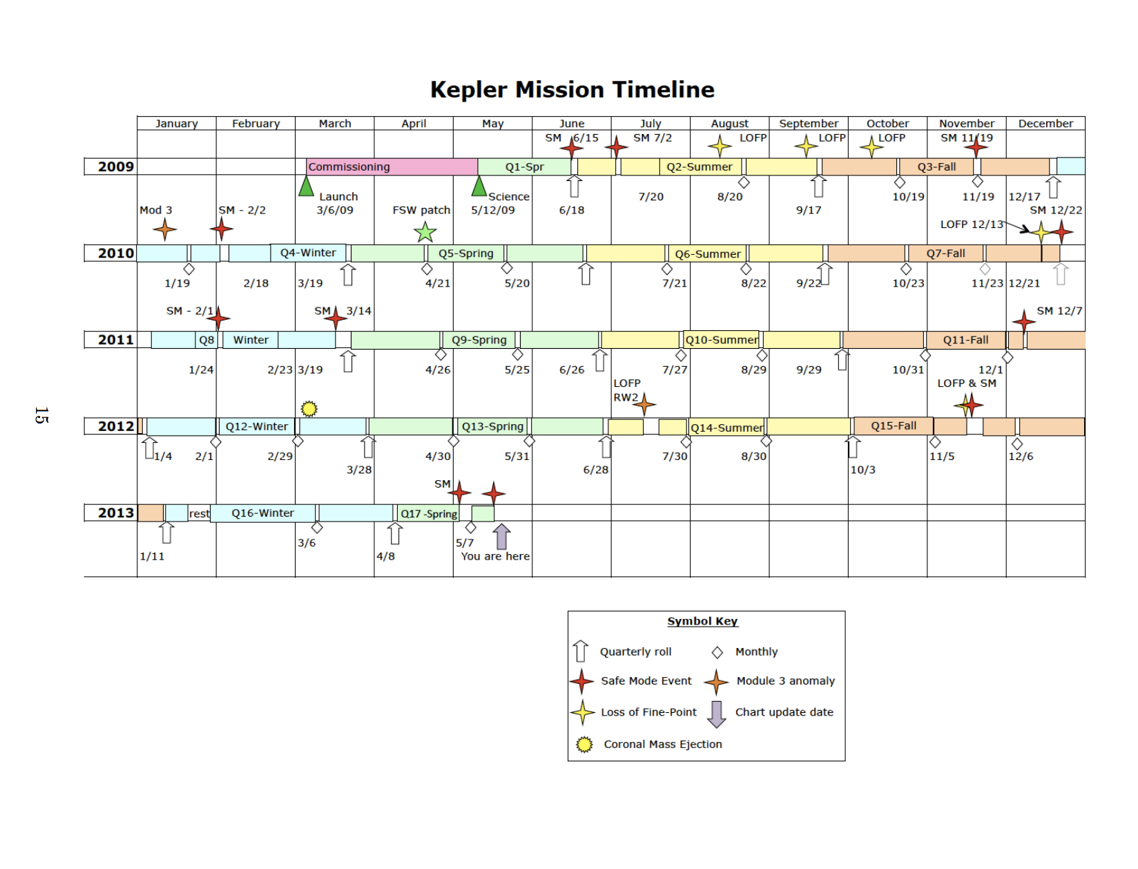
The ‘camera’ has a total resolution of 94.6 megapixels, however this is simply too much data to be stored and sent back to earth so ~6% (5.4 megapixels) of pre-selected relevant pixels would be requantized, compressed, stored, and sent back to us. Though powered by solar panels, the photometer does not allow sunlight to enter it. The purpose of Kepler is to detect exoplanets, which involves distant stars, not the one that’s close to us. The ‘camera’ is really a complex array of CCD’s each of which has 84 data channels. An LDE (Local Detector Electronics box) converts the CCD output analog signals into digital data. The focal plane, basically the array of CCD’s or the ‘camera’ is supercooled to -85C by heat pipes that carry the heat to an external radiator. Think of the heatsink you place ontop of your computer’s CPU. The LDE contains pretty much all the sensors that detect the temperature of this fragile system.
Q12 - Coronal Mass Ejections caused a increase in dark current, in addition to a pronounced drop in sensitivity for a small number of pixels. The autocorrecting mechanisms cannot fix this, which means it’s finally data I can use. This is only observable for faint targets. This is true also for Q14, Q16. Each of these Quarters should display particular patterns.
Select stars that were used in the above listed Quarters. For instance, KOI2842228 was used for Q2-17, so plot its light curve for the above listed Quarters and compare to normal Quarters. Do this for multiple stars. Do this for fainter stars (Dwarves, for instance).
Faint stars have more noise, so these light curves will need to be cleaned up.
Pixels 0:19, 12:1111 are masked physical pixels used to measure dark current. These are physical images I will observe to confirm my findings from cleaning up of noisy light curves.
Dark Current - Mostly undetectable at -85C, except for ‘hot pixels’ which have anomalously high dark current. 5 deviations threshold above the mean bias level.
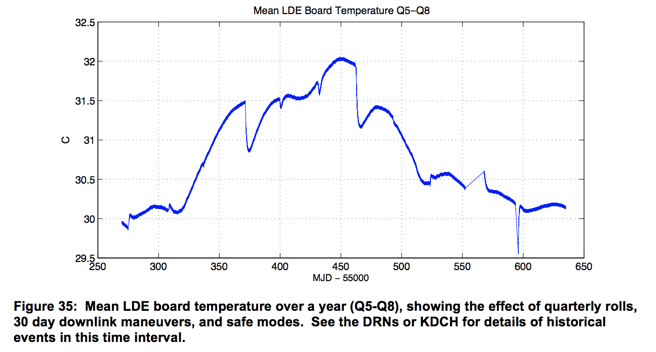
Monthly, Monthly, Quarterly Roll, Monthly, Monthly, Quarterly Roll, Monthly, Monthly, Safe Mode Event, Quarterly Roll, nothing, nothing, Quarterly Roll. The general trend is explained by the seasons: from Spring, Summer, Fall, to Winter. This corresponds to the Mission Timeline I posted up top. How convenient that they provide data reassuring us of the “benign thermal environment” for the only period of time that didn’t experience CME’s or other failures.
Kepler Science Processing Pipeline
Having read this, it seems that Kepler’s pipeline already accounts for Gaussian observation noise. Since I’m basically in the ‘exploratory data analysis’ stage, I figured why not observe the effects of Gaussian filtering on a transit lightcurve.
Since I am at the library and don’t have my programming setup here, I’ll just write “What to do” here.
What to do:
- Download the massive Kepler dataset
- Look at the following statistics, all by # of stars: Mean Intensity, Median Intensity, Intensity Standard Deviation, Maximum Intensity, Minimum Intensity, Intensity Skewness.
- Make visualizations of Intensity Time Series - look for patterns, particularly periodic dips indicating exoplanets, whether the noise looks sinusoidal, whether there are anomalous points particularly at high intensity.
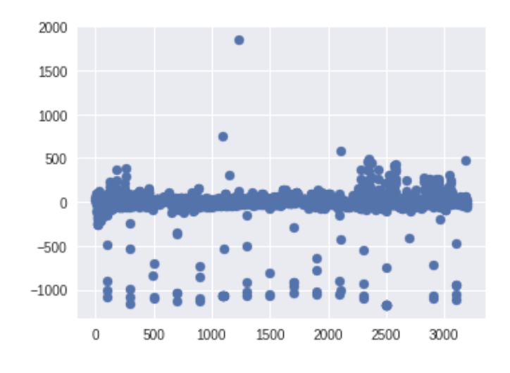
Here’s an example of some upward pulses that could be due to instrumental noise:
- Data Processing - Outlier Removal - Start with small stuff like a wide median filter. Then a Gaussian FIR filter. Then a 4th order Savitzky-Golay filter which is basically an FIR version of running a polynomial least-squares fit at every point. This means it doesn’t just give estimates for the denoised signal, but also some of the derivatives. There’s tons of filters, I’ll see what happens.
Project Killblue
I took one photo of a star in the blue daylight on the fourth of July at 11AM. I was never able to replicate it. I did try segmentation to remove things that were not blue, and edge detection of larger objects like the moon, but I could not do this for that tiny speck of a star.
I was able to take many photos of Jupiter. I used this as labeled data to train a CNN to be able to find it in photos where there are no stars, just the moon, and different times of day. I get so-so results when finding Jupiter in images with other stars. I don’t nearly have 10,000 images of Jupiter though, and the images I do have are with my phone camera, so my training data set is a limiting factor.
I picked up an old book on Information Theory to gain some much-needed insight into just what I am doing with a camera, but ultimately I just have been stuck at the taking photographs stage of this project. I can’t lay idle though, and Prof. Hogg’s post here gave me some ideas. I downloaded satellite data from NASA Worldview, particularly that of cloud formations. I chose cloud formations because that’s the one constant among all of the different things recorded there (hurricanes, fires, etc.) I can make arbitrary categories of cloud formations that share some type of aesthetic quality thereby segmenting whole images. I can visualize these with masks, which I can also measure the size of. I’ve used imgaug, albumentations, catalyst, and pytorch’s segmentation models. These are very helpful and I am able to produce thousands of images for training/test data. I was also experimenting with frequent pattern discovery to see if some of these categories of cloud formations appear frequently together. As for the machine learning aspect, I’ve used a variety of architectures that I can elaborate on later. At the moment, I am just trying to evaluate how I can use what I am doing in a way that is relevant and can bring new insight.
This slideshow is very interesting. I think I can find which cloud features can be most informative to various things like sunglint, hurricanes, and ultimately climate change.
Again, I’m at the library so I can’t get to writing code now. But I will next time.
That’s it for now.